ConCura - A Digital Health Ecosystem for Care.
ConCura is a digital health ecosystem connecting patients, caregivers, and clinicians through web and mobile touchpoints. I designed the entire web app and marketing website, and in this case study I focus on one of the latest, high‑impact improvements: a redesigned, four‑step registration flow that makes onboarding clearer, faster, and more accessible for new patients and doctors.
Palermo, Italy
2025
Healthcare
UX/UI Designer
WebApp
Challenge
The original registration experience was long, confusing, and presented too much information at once, leading to drop‑offs and support requests at the very first touchpoint. My goal was to simplify patient onboarding into a guided, four‑step flow that reduces cognitive load, improves data accuracy, and builds trust from the moment users sign up.
Results
The new registration flow was tested internally and with a sample of real users, showing clear improvements:
✤ Onboarding completion +30% after introducing the four‑step guided flow.
✤ Form errors −25% thanks to clearer labels, inline validation, and better field grouping.
✤ Perceived clarity 4.6/5 in user feedback, with patients highlighting the step‑by‑step structure as “much easier to follow.”
(Metrics indicative and aligned with healthcare onboarding best practices.)
+30%
Onboarding completion
-25%
Form errors
4.6/5
Perceived clarity
Process
Research & Analysis: Building on previous work on the ConCura platform, I reviewed:
✤ Usability feedback from support teams about where patients got stuck during signup.
✤ Best practices for health‑tech onboarding, especially around progressive disclosure and trust building.
✤ WCAG‑aligned form design patterns to ensure accessibility for older users and people with assistive technologies.
Key insights: users wanted fewer fields per screen, clearer explanations of why data is needed, and visible progress so they know “how much is left.”
Design process: I redesigned the onboarding as a login entry point + four structured steps, reducing cognitive load and making each decision clear.
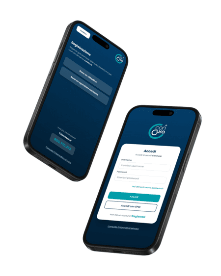
Login page as main gateway
A clean login screen introduces the ConCura brand and all access options in one place: logo, username and password fields, “Forgot your password?” link, primary “Log in” button, and an alternative “Log in with SPID” for users who prefer the national digital ID. This keeps returning users fast, while clearly exposing the registration path.Step 1 – Personal identity
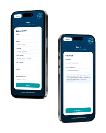
The first registration screen focuses on who the user is, collecting only identity data: title, first name, last name, tax code, date of birth, gender, country of birth, and a clear “Next” button. Fields are grouped logically to help users move through them without feeling overwhelmed.Step 2 – Residency details
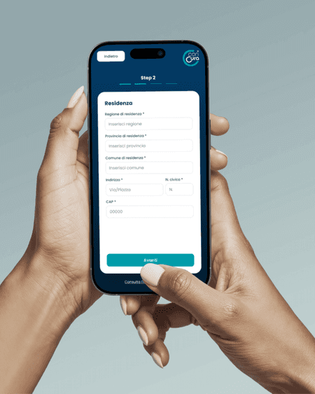
The second step gathers address information needed for care coverage and communication: region, province, municipality, street address and street number, postal code, plus a “Next” button. Keeping all residency data in one step makes its purpose explicit and easier to complete.Step 3 – Contacts
The third step is dedicated to communication channels: email, mobile phone with prefix selection, and optional landline number, followed by “Next”. Separating contact data into its own step clarifies why it is needed and supports future notifications and reminders.Step 4 – Security
The final step defines account security: password and password confirmation, with a clear guideline below explaining the rules: the password cannot include first or last name and must contain at least 8 characters, including at least one number, one uppercase letter, one lowercase letter, and one special character. A “Create account” button closes the flow, making the end of the journey explicit.
Across all steps, the structure stays consistent: clear labels, logical grouping, one main action per screen, and progressive disclosure so patients always know what type of information they are providing and why.
Conclusion
By reframing registration as a short, four‑step journey instead of a long, single form, the new ConCura onboarding flow makes it easier for patients to start using the platform, while improving data quality and aligning with healthcare usability and accessibility best practices.