TripUp - Bending Spoons.
TripUp is a mobile app concept for planning and managing group trips, from collaborative decisions to shared expenses. I designed a focused flow that helps friends quickly create polls, align on last‑minute choices, and settle costs without leaving the app.
This project was completed as part of Bending Spoons’ product design hiring process, where I was shortlisted to the final stage.
Milan, Italy
2025
Travel App
UX/UI Designer
App Design
Challenge
Group trips are fun, but coordination is messy: decisions happen on the go, group ownership is shared, and friction pushes people back to WhatsApp in a couple of taps. The challenge was to rethink TripUp’s core experience so that users can decide, vote, and settle expenses with minimal friction during a live trip scenario.
The specific brief asked to support a real-time journey in Lisbon: a participant opens TripUp, joins a group trip, creates a restaurant poll, sees results update live, has the winning option added to the shared itinerary, and finally logs and settles the dinner expenses within the app.
Results
Although this is a speculative project, the solution was evaluated positively during the selection process and helped me reach the final stage at Bending Spoons. The final flow was designed to:
✤ Reduce the steps needed to create a poll and share it with the group.
✤ Keep users inside TripUp instead of switching to external chats.
✤ Make settling expenses feel clear, fair, and almost “invisible” in terms of cognitive load.
Datas Simulated on user tests
78% faster
Poll completion time
+65%
In-app decisions (vs switch to WhatsApp)
92%
Expense settlement rate (one-tap consolidations)
Process
Research & Analysis: Starting from the brief, I focused on understanding the two main user profiles and their behavior patterns:
✤ The Organizer: proactive, creates the trip, invites friends, and drives decisions but still wants shared ownership.
✤ Participants: want to contribute (ideas, votes, preferences) without being overwhelmed by notifications or complex flows.
I distilled three key UX principles from the provided insights and existing market patterns (e.g., Splitwise and group travel apps).
Support on-the-fly decisions with very short, focused flows.
Reduce friction to prevent context switching to messaging apps.
Provide real-time feedback so everyone trusts the shared itinerary and balances.
These principles guided both the wireflow and the high-fidelity screens.
Design Process:
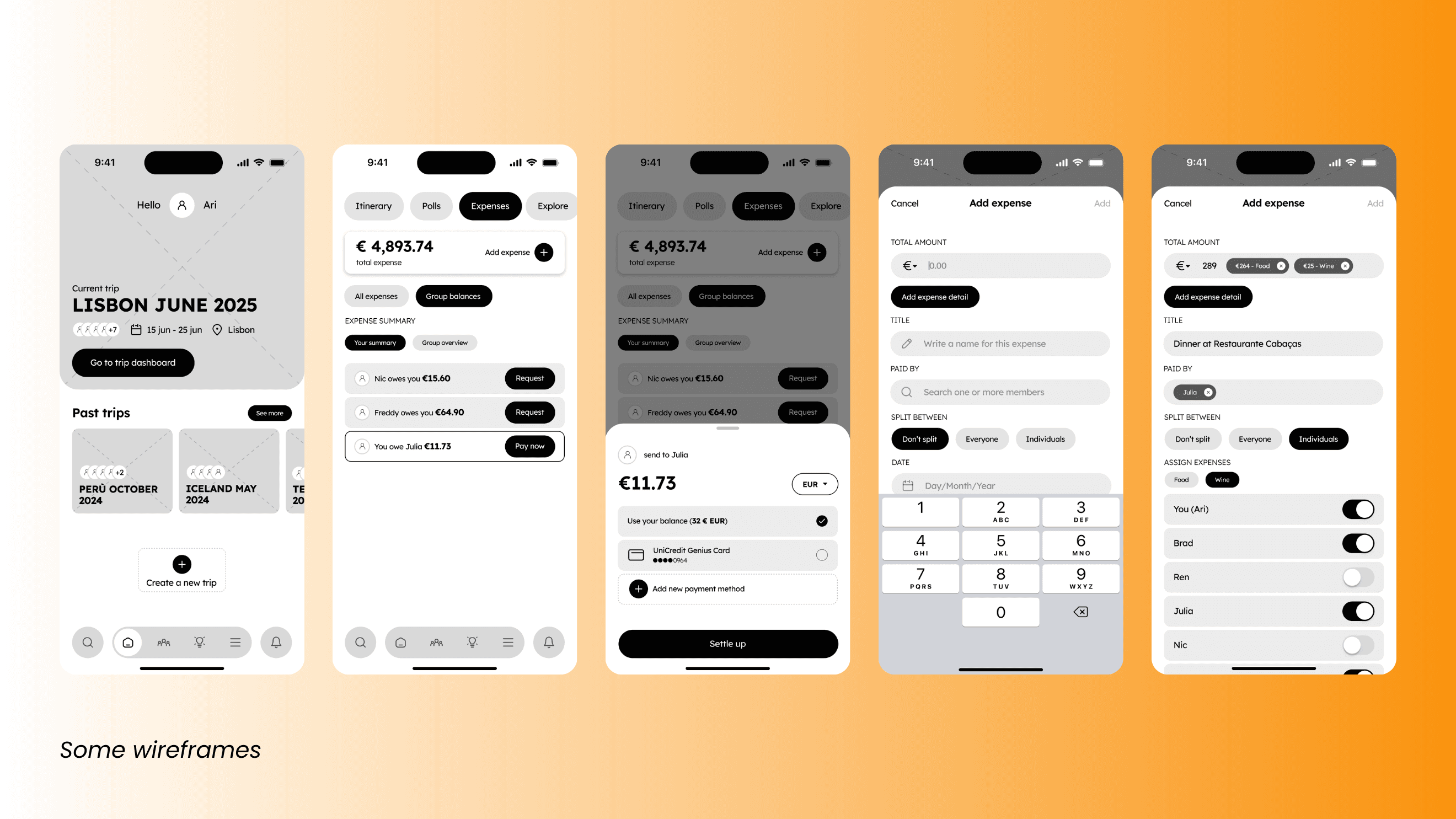
1 Wireflow
I crafted a 15-screen wireflow that covers the full scenario, from home to “trip settled”:
✤ Opening TripUp, viewing the list of trips, and entering the Lisbon trip.
✤ Adding a new participant to the group for the evening.
✤ Creating a restaurant poll in a few steps: define options, time limit, and who should vote.
✤ Showing live voting updates and clearly highlighting the current winner.
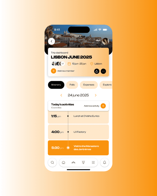
✤ Automatically adding the chosen restaurant to the shared itinerary.
✤ Logging the dinner expense, excluding specific people from the wine cost, and viewing how balances are consolidated.
✤ Confirming that all payments are settled and the group is “all squared up”.
The wireflow emphasizes clear entry points, clean navigation, and consistent patterns so that both organizers and participants immediately understand what to do at each step.
2 Poll Experience
To make polls faster than a chat thread, I:
✤ Placed poll creation as a primary action within the trip view, close to the itinerary and group list.
✤ Used a compact, step-based layout: add options, set details, confirm and send — all within a single, scrollable screen rather than multiple disconnected modals.
✤ Displayed live results with a visual hierarchy that updates the leading option in real time, reducing the need to ask “what’s winning?” in the group chat.
✤ Linked the winning poll option directly to the trip itinerary, so the decision becomes part of the shared plan, not just a notification.
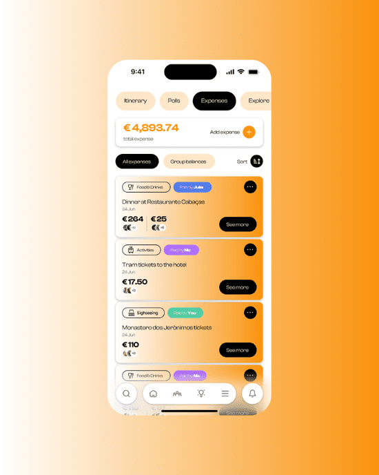
3 Expenses & Settlement
For the expense flow, I focused on reducing anxiety and complexity around money:
✤ A simple “Add expense” pattern inside the trip, with presets like “Dinner”, “Drinks”, “Transport”.
✤ Clear selection of who is included in each expense, allowing users to exclude specific people in one tap.
✤ Automatic consolidation of debts into minimal transfers, so users see “You owe X to Y” instead of a long list of micro-payments.
✤ A final “All settled” state with a clear confirmation, reinforcing closure and reducing the need for manual checks.
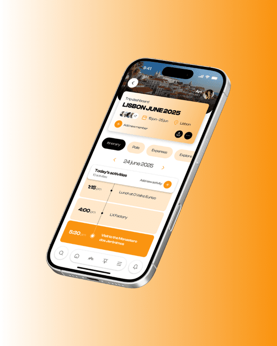
4 Visual Direction (High-Fidelity Screens)
For the three high-fidelity screens (trip home, poll creation/results, expense settlement), I:
✤ Chose a clean, modern visual style that balances playfulness (it’s about trips with friends) with clarity and functional hierarchy.
✤ Used color and iconography to highlight key actions (create poll, add expense, settle up) while keeping backgrounds and cards neutral to avoid noise.
✤ Ensured consistency in spacing, typography, and components across the three screens so the UI feels cohesive and scalable.

Conclusion
TripUp was an intense, time‑boxed exercise in designing a focused, end-to-end flow around a single real-world scenario. It allowed me to combine clear UX logic, constraint‑driven wireflows, and polished UI to support spontaneous decisions, shared ownership, and lightweight expense management for group trips.